
DataVizing in the Time of Cholera
11
Mar
Posted by: Aishwarya Bhatia
Category:
Public Health and Nutrition
No Comments

In a rather somber list of the deadliest pandemics our world has faced, the Cholera pandemic of 1852-60 ranks 7th, killing close to a million people in its wake.
Having narrowly escaped the COVID-19 pandemic, we understand the role that heresy and misinformation can have on the world. During the cholera outbreak in Britain, people believed it was transmitted and spread by ‘bad air’ or ‘bad smells’ from rotting organic matter. It was all guesswork until a physician named Dr. John Snow cleared the air. https://ovo99.io/
Unlike his fictional namesake, this John Snow knew a lot about Cholera. His hypothesis was based on the poor drainage system throughout London, leading to contaminated water seeping inside city systems.
Snow identified a contaminated public water pump as the outbreak’s source through his conclusive interviews with residents.
But how did he come to this conclusion?
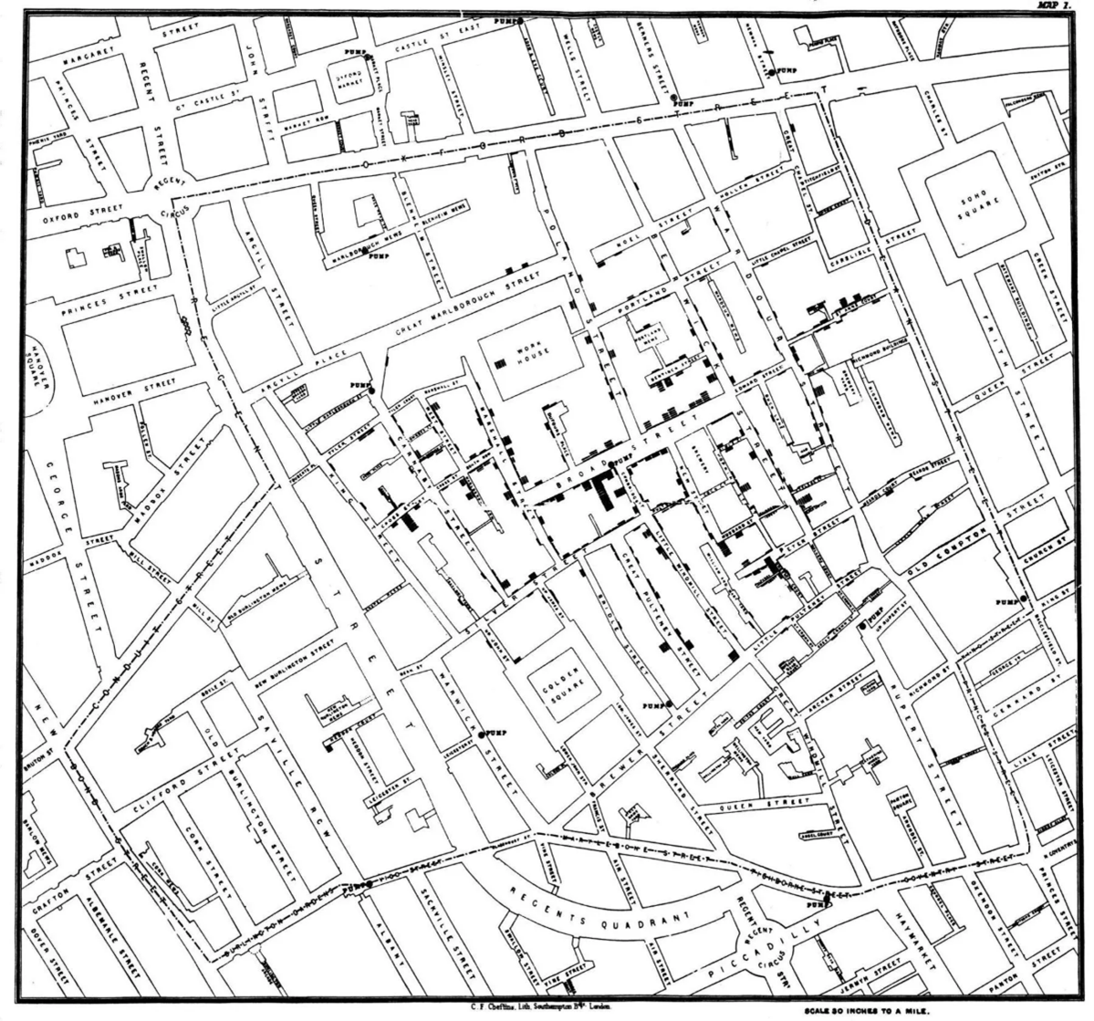
One of the pioneers of health charting, Dr. Snow, mapped the deaths from cholera and noted that most of them access water from the contaminated pump.
Using a map of the area around Broad Street, where the contaminated pump was located, Dr. Snow created this dot map visualization using small bar charts. The bars represented the number of cholera deaths in each household.
The simplicity of this chart reveals the cause of deaths visually: one can see the density of the bars increasing in the areas located around the contaminated pump. His scope of the study did not end there. Two water companies famous for supplying mechanically pumped water to people living in South London were found guilty of taking water from sewage-polluted sections of the Thames and delivering the water to homes, leading to increased cholera.
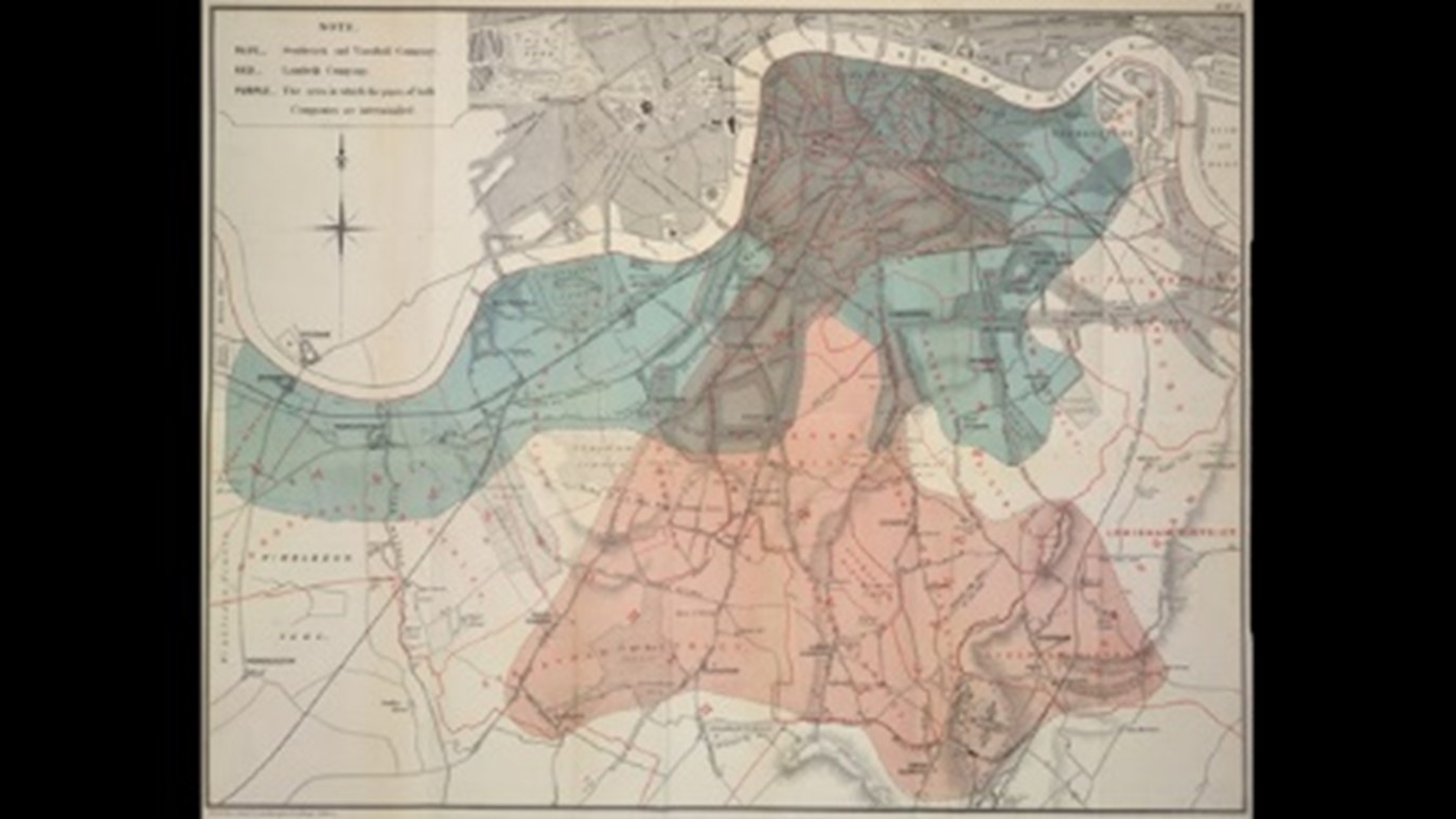
Snow created a map highlighting areas that received water from these companies alongside a statistical table setting out the dates rates in the area served. Such geographical visualization revealed that the company serving contaminated water had a mortality rate of 71 deaths per 1000, showing the source of all those deaths.
Dr. Snow is a pioneering figure in disease mapping and is considered one of the founders of modern epidemiology. His work fundamentally changed London’s water and waste systems, improving general public health worldwide.
We have come a long way from 1854. Technological advancement and a greater understanding of creating well-equipped health systems have been accompanied by evolving species of microorganisms that threaten every single living being on this planet.
Disease mapping has emerged as one of the essential tools to evolve in this fight against various viruses. Data visualization has also come far from drawing bar charts on a physical map.
Let’s take John Hopkin University’s animation showing cumulative COVID-19 cases being reported globally. Through the various hues of scarlet, the map tells us how many people were infected in different countries over the same period.
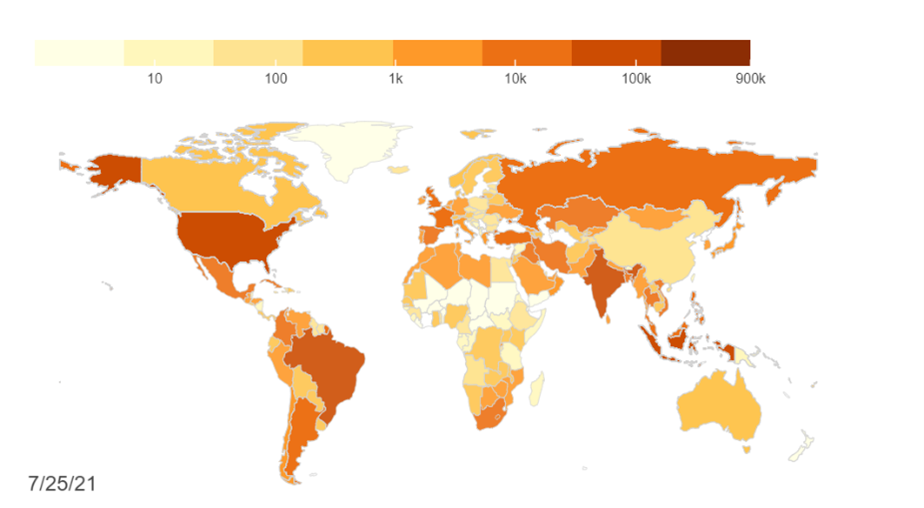
This is just one dataviz from a long list of visualizations available for us to explore and delve deeper into, which can be viewed here.
Problems have evolved, and so have interventions. We view global issues analytically, but the fear that grabs hold of us is still the same. For better outcomes and health intervention, visualizing the scope of the problem can help pave the way to possible solutions that eradicate the basis of the https://www.game-lover.org/en/ fear altogether—an idea that Dr. Snow would approve.
Aishwarya Bhatia, Sambodhi