
The Big Three of Modern Charting: Mapping the History of Data Visualization Through its Pioneers
04
Feb
Posted by: Aishwarya Bhatia
Category:
Analytics and Visualization
No Comments

Visualization is not a new trend: it has existed since the advent of human existence in this world. Think of cave paintings or stone maps, markings that worked as hunting guides or directions to a river far off from a settlement. Romans were renowned mapmakers, who tracked their trade and army movements from 366-335 BC using such visualizations.
When mankind ventured outside their lands, past the vast oceans, Ptolemy’s world map from the 2nd century AD introduced a type of visualization that revolutionized map making, bringing applied scientific method, math, and astronomy to what we understand as modern maps today.
Thus began the journey of data visualization: from maps to interactive visual dashboards, we have come very far, but this journey cannot be charted on a linear chart.
In this article, we will examine the development of visualization through the giants that created this art and paved the way for data visualization as we know it today.
William Playfair:
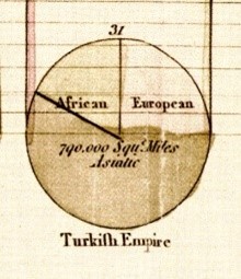
The first pie chart was created to represent the land mass of the Turkish empire, with the sectors indicating the fractions of the empire lying in Europe, Asia, and Africa. This pie chart was colored sloppily by the hand of William Playfair, a Scotsman imprisoned in a debtor’s prison.
If we were to set aside his eccentric life trajectory involving espionage, Playfair’s journey to charting began with his fascination with the Industrial Revolution. It brought about opportunities to compile data and learn from its analysis. The phrase, ‘a picture is worth a thousand words’ became the pinnacle that led to Playfair condensing a multitude of numbers into graphs or charts.
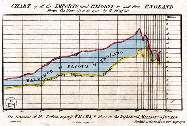
One thing led to another, and he published The Commercial and Political Atlas in 1786, which used graphical representations of data to describe the balance of trade in England. This book included popular graphs we use today such as line, bar, circle, and pie charts.
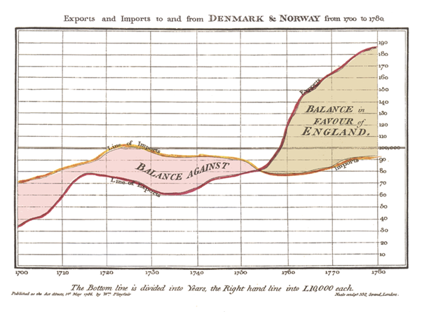
In this Atlas, Playfair also included what we now call the time-series chart: it shows the fluctuating balance of trade (the differences between imports and exports) between England and its trading partners, both collectively and individually. Incorporated with all the necessary elements, this chart is comprehensive and continues to be an example how time-series charts are made today.
In fact, his work on such charts took him to France, where Louis XVI, who we know because of the infamous French Revolution, bankrolled him with capital to build a rolling mill in Paris. No wonder he’s often called the father of modern graphical display.
The most famous of his charts is the Playfair Imports Exports, where he compares exports from England with imports into England from Denmark and Norway between 1700 to 1780.
Charles Minard:
After the French Revolution, came the reign of Napoleon Bonaparte, the infamous military general who turned into a tyrant soon after. In his effort to expand his kingdom, he sent his army on a campaign across Russia to invade the land.
Today, it is characterized by its massive toll on human life: in less than six months, nearly a million soldiers and civilians died.
Charles Minard took it upon himself to chart these casualties and their causes in 1869 in what Edward Tufte calls “the best statistical graphic ever produced”.
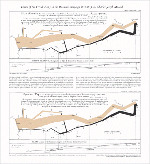
This chart unites six different sets of data: geography, the army’s course, direction, number of soldiers remaining, temperature, and time. If we pause and ponder, we realize that during the Russian campaign in 1813-1813, Napoleon entered Russia with 4,42,000 men, captured Moscow with 1,00,000 men left, and was left with 10,000 shivering soldiers when the army’s abandoned ruins became their reality.
Minard is renowned for this map, but, in his lifetime, he produced nearly 50 maps, pioneering and perfecting the others. In fact, while the pie chart was invented by Playfair, it was Minard who elevated the idea: he was the first to use pie charts on a map and turning them into proportional symbols.
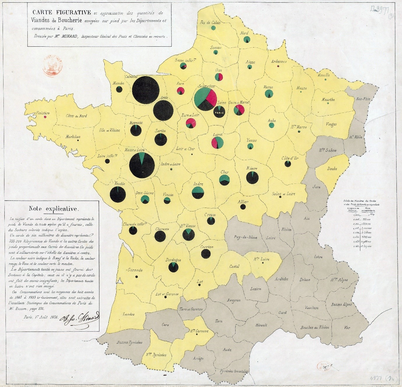
In this chart, he shows the origin of butcher’s meats supplied to Paris markets in 1858 from each of the country’s departments. The size of the pies indicates how much total meat came from each location, while the colors indicate which type of meat, black for beef, red for veal and green for mutton. The regions in yellow contributed some meat, while the meatless areas are tan colored.
Thus, three different datasets have been portrayed without forgetting their variables to give you technique that is still being used by cartographers a century and a half later.
Florence Nightingale:
That’s right, not all men!
Florence Nightingale is known for being a British nurse and a social reformer, however, she is also an English statistician.
During the Crimean war, Nightingale arrived at a British hospital in Turkey to a sight of chaos and misery. Without access to enough food and medical supplies, the inured were piled next to each other in endless corridors. Nightingale took it upon herself to reform the place, by transforming the working of the hospital, bringing her knowledge of medicine to save countless lives.
How did she do it?
Nightingale applied statistics.
With the help of a friend, Nightingale compiled data about the number of deaths and the causes. She found that a lack of sanitation was the principal reason behind deaths. After working on improving the sanitation in the hospital, she observed that the mortality rate dropped from 52 percent to 20 percent.
Her findings were legitimate, but she needed to convince Queen Victoria of the need to improve sanitary conditions in military hospitals. This led to the creation of the coxcomb, also known as a rose diagram, which resembles a pie chart. It depicted British casualties in the Crimean war resulting from preventable infections.
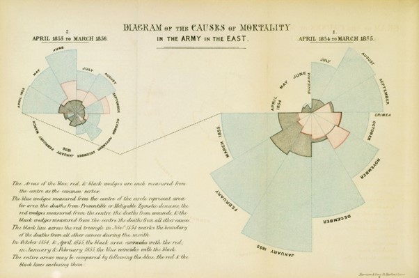
The blue wedges stand for deaths caused by preventable infections, red wedges show deaths due to wounds, and black ones show deaths from other causes. In a single glance, the diagram communicates just how much the health of the men in the army had a direct bearing on its effectiveness as a fighting machine.
For months during the first part of the war, April 1854 to March 1855, the blue wedged are far larger than either of the rest. For months after March 1855, after the Sanitation Commission helped the hospital in Turkey, the blue wedged start becoming drastically smaller.
One may suggest that a bar graph would have achieved the same purpose, but the effect would have been drastically different. The image arrests the viewer, which was apparent in the way that changes in design and practices of military hospitals were carried out. By the end of the century, Army mortality was lower than civilian mortality!
Nightingale’s chart presents an enormously important case for the use of data visualizations being a powerful tool for reform. Today, when countries all over the world are coming together to achieve Sustainable Development Goals, the https://consultation.shuddhi.com/ importance of data visualization cannot be overstated.
References:
https://enfoco.ffyb.uba.ar/tag/vih/
https://bigthink.com/strange-maps/229-vital-statistics-of-a-deadly-campaign-the-minard-map/
https://www.sciencenews.org/article/florence-nightingale-passionate-statistician
https://towardsdatascience.com/a-short-history-of-data-visualisation-de2f81ed0b23
Aishwarya Bhatia, Sambodhi