
Pie Chart: A Revolutionizing Data Visualization Tool
01
May
Posted by: Sambodhi
Category:
Analytics and Visualization
No Comments

Making data visualization and representation easy is important because it allows us to understand complex information quickly and accurately. When data is presented clearly and concisely, we can use it to make informed decisions and solve problems more effectively. Using tools such as graphs and charts, we can simplify data and communicate in a way that is easy to understand for everyone. One such tool is the pie chart. Let’s understand it in a bit more detail.
What is a pie chart?
A pie chart is a graphical representation of data that uses a circular-shaped diagram. It is commonly used to illustrate data in a way that is easy to understand, mainly when dealing with percentages or proportions. Each section of the chart represents a specific category, and the size of the section is proportional to the data it represents.
What is a pie chart used for? Why is it used?
Pie charts are useful because they allow viewers to compare different data points’ relative size or importance quickly. They are especially effective when there are only a few data points to display or when the data is broken down into distinct categories.
Pie charts are commonly used in various fields, such as business, finance, education, and research. For example, a business might use a pie chart to show the breakdown of sales by product, while an educational institution might use a pie chart to show the percentage of students from different countries.
When interpreting a pie chart, it’s essential to understand that the size of each section represents a proportion or percentage of the total data. For instance, if a pie chart shows that 50% of a company’s revenue comes from Product A, it means that Product A is responsible for half its overall revenue.
What is a pie chart in Excel?
Creating a pie chart in Excel is relatively easy and can be done using the “Insert Chart” feature, where users can choose a pie chart type, input the data they want to represent, and customize the chart’s appearance to suit their needs. Excel also provides many formatting options for pie charts, including changing colors, adjusting font sizes, and adding labels, making them an effective tool for visualizing data clearly and concisely.
What is a pie chart in statistics?
Pie charts are commonly used in statistical analysis, research, and data visualization to communicate data to a broader audience in a simple and intuitive way. They are especially useful for showing the relative size https://clinics.shuddhi.com/ of each data point and comparing data points to each other. For example, a pie chart can show the percentage of different age groups in a population or the proportion of various car brands sold in a particular region.
However, pie charts in statistics have some limitations and may not always be the most appropriate way to present data. They are not well-suited for displaying large data sets or comparing more than a few data points. Other charts, such as bar charts or histograms, may be more appropriate. Nonetheless, pie charts remain a widely used and valuable tool for visualizing data in statistics.
What are the different types of pie charts?
Pie charts are of different types based on their design and purpose. Some of the common types of pie charts include the following:
- Basic Pie Chart
This type of pie chart is the most commonly used and shows the relative proportions or percentages of the displayed data points.

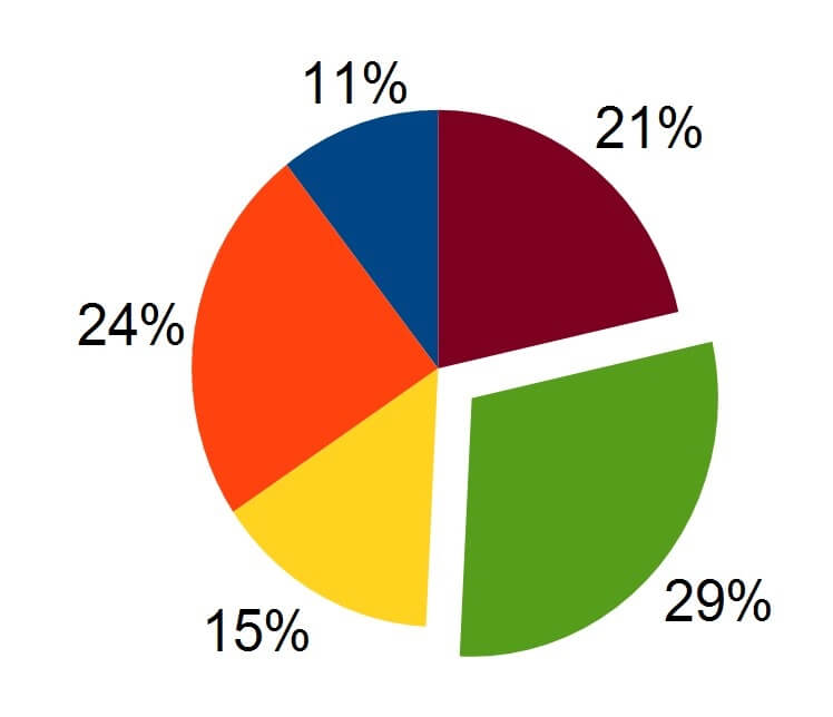
- Exploded Pie Chart
Here, one or more slices are separated from the rest of the chart to highlight their significance.
- 3D Pie Chart
A 3D pie chart adds depth and perspective to the chart, making it appear as if the slices are popping out of the chart.

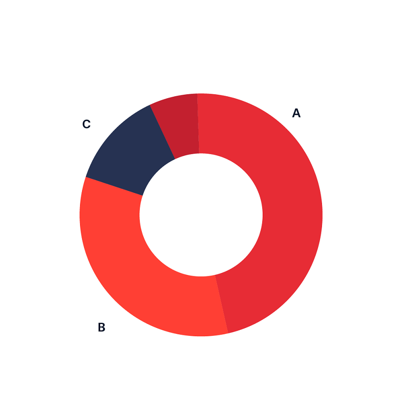
- Doughnut Chart
This chart is similar to a basic pie chart but has a hole in the middle. It is useful for showing the relationship between two different sets of data.
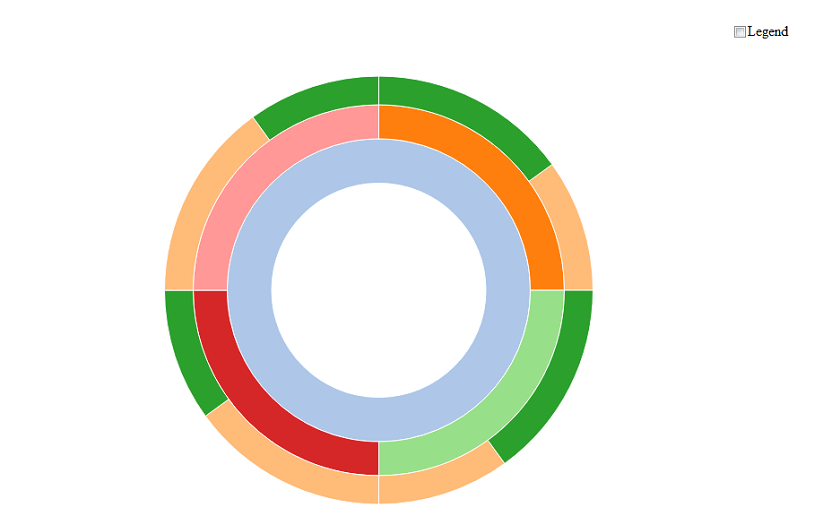
- Nested Pie Chart
Also known as a concentric chart, this shows multiple levels of data with one pie chart nested inside another. This type of pie chart helps display hierarchical data.
- Polar Area Chart
This is similar to a pie chart, but the slices are displayed as sectors of a circle instead of a pie. The area of each sector is proportional to the value it represents.
 The choice of which type of pie chart to use depends on the specific data being displayed and the chart’s purpose.
Why is it called a pie chart?
The term “pie chart” was first used in 1923 by the British statistician G. F. Mayhew. It’s called a “pie chart” because it looks like a circular pie sliced into different pieces. Each slice represents a portion or percentage of the total data being displayed. Its circular shape and slices resembled a traditional pie, hence the name “pie chart.” The name stuck over time and has become a standard term for this type of chart.
Did you know?
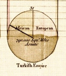
- The concept of a pie chart was first introduced by William Playfair, a Scottish economist, in the late 18th century. He developed several different graphical representations of data, including the line graph, bar charts, and pie charts. In 1801, Playfair published “The Commercial and Political Atlas,” which included the first known pie chart. He used it to show the proportion of trade between England and other countries during the 18th century.

Source: https://www.m-a.org.uk/resources/PE4LifeofPie.pdf - Florence Nightingale, the pioneering nurse and social reformer, was a pioneer in the use of statistical graphics and data visualization, including pie charts. In the mid-19th century, Nightingale used visual representations of medical data to illustrate the causes of death among soldiers during the Crimean War. She created a series of “coxcomb” charts, which were essentially pie charts with varying https://backfortyonline.com/carry-out/ width slices, to show the different causes of mortality. Her charts were ground-breaking in using visual representations of data to highlight patterns and trends, and they helped change public health policies and practices.
- The most extensive pie chart ever made was created in 2008 in Mexico City, comprising over 20,000 individual pies.
What is the formula of a pie chart?
There is no specific pie chart formula, but they are based on displaying data as a proportion or percentage of a whole. The size of each slice in a pie chart corresponds to the proportion or percentage of the total data it represents.
To calculate the size of each slice, you need to determine the total of all the displayed data points. Then, you can calculate the percentage or proportion of each data point and represent it as a fraction of the whole. This fraction is then multiplied by 360 degrees, the total angle of a circle, to determine the angle of each slice.
Let’s take a case that can give a pie chart example with an explanation. If a pie chart displays the percentage of sales for different products, and the total sales amount is INR 100,000, a product that sold INR 20,000 would be represented by a slice of 20% of the total sales, or 1/5 of the total. The angle of this slice would be 1/5 multiplied by 360 degrees, which is 72 degrees.
Pie charts are an effective way to present data visually, which can be helpful for research and policymaking. Policymakers and researchers can use pie charts to quickly understand data distribution, identify trends, and decide based on the information presented. Pie charts can also help communicate complex data to a non-technical audience. Using pie charts to offer data, policymakers, and researchers can more easily identify areas requiring further attention or policy changes.