
How Line Graphs Can Help You Understand Your Data Better
29
Mar
Posted by: Aishwarya Bhatia
Category:
Research and M&E
No Comments

Having deciphered historical data visualizations over the past few weeks, we are now interested in discussing seemingly simple graphs to decode the complex information they can display. Line graphs are one of the most common data visualizations that show change over time.
Line Graph Definition
A line graph is a type of data visualization used to show information changing over time, thereby detecting changes using several points connected by straight lines.
A line graph helps determine the relationship between two sets of values when one data set is dependent on the other set.
Purpose of a Line Graph
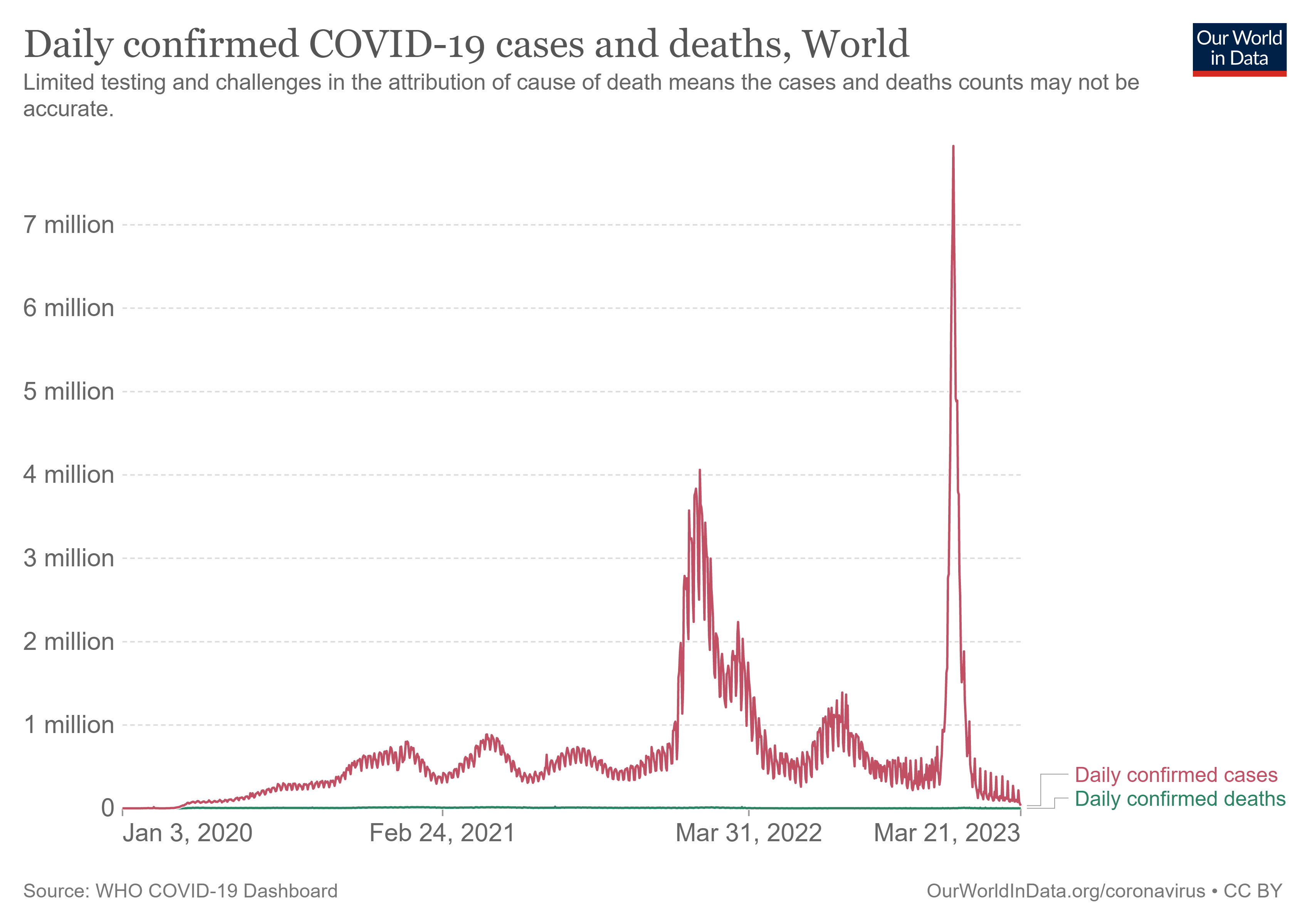
The purpose of such visualization is to track changes over time, but there is debate about how continually the data must be measured. Let’s use COVID-19 cases as an example and examine how the number of cases has increased. Some line graphs can track it every day, while others can do it once a month. This gives a more accurate picture of how it affects things. Line graphs can also help determine what will happen with data that has yet to be collected.
Line Graph Examples
The difference lies between the purpose. For policymakers, a daily rise in cases may not be the most helpful information since trends over months that show how policies are working may be a better sign https://j99slotmaju.com/contact-us of how well they are performing.
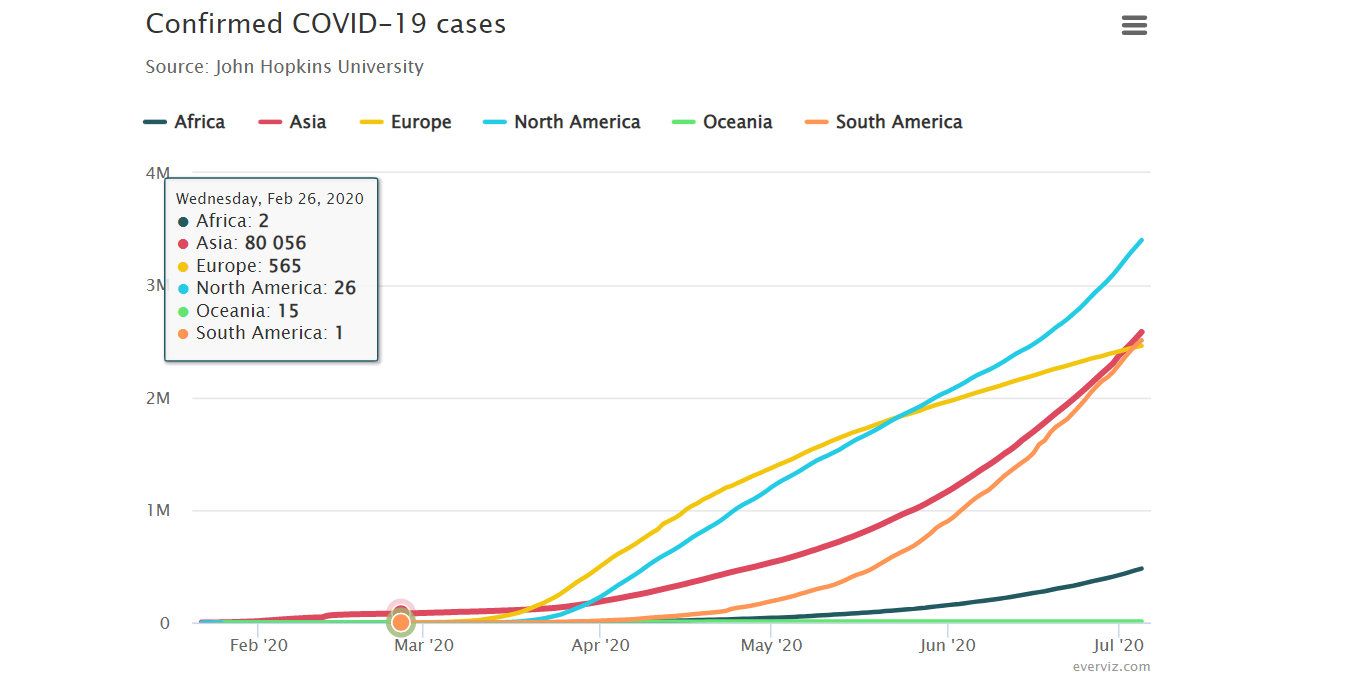 The average person deciding whether to take their kids to a park during a pandemic will benefit from seeing the daily rise in cases.
 Did you know who invented the line graph?
The bar and line graph inventor William Playfair was the first to apply geometry principles to finance matters. While his contribution to data visualizations is pioneering, his other contributions include blackmailing lords and being sued for libel. Playfair’s eccentric and slightly criminal lifestyle led to his belief in making things simple to understand. The eye was the best measuring instrument known to Playfair, and his invention of the line graph is a testimony of the same.
Let us now delve into the most common questions asked about line graphs.
What are the properties of line graphs?
In a line graph, the independent data set is on the horizontal x-axis, while the dependent variable is marked on the vertical y-axis. An overall trend can be seen once a line connects these values, making it a line graph.
Multiple line graphs are also a common type of data visualization. They show more than one variable for comparison trends between two quantity attributes, thereby depicting two data sets against a constant value.
What are the advantages of line graphs?
Usually used to represent changes over time, line graphs are used best while highlighting anomalies within and across data series.
We can also detect small changes that are challenging to measure in other graphs since we have line segments connecting every two data points.
What are the disadvantages of line graphs?
Multiple lines on a graph can make it hard jhanpa lgoms to read and defeat the visualization’s purpose. So, line graphs become unsuitable for large data sets. Its application is also limited to data sets that are numerical or whole values.
With all their pros and cons, line graphs are an https://trkpgcollege.com/admission/ excellent tool for visualizing data precisely because of their easy-to-read nature.
Aishwarya Bhatia, Sambodhi